What Is "Flexible Design That Can Adapt"? A Behind-the-Scenes Look at StoreHero's Logo Renewal by Fracta
StoreHero has renewed its logo and is gradually rolling it out across our website and products. We entrusted the logo design to Fracta, our total branding partner and a firm well-versed in Shopify.
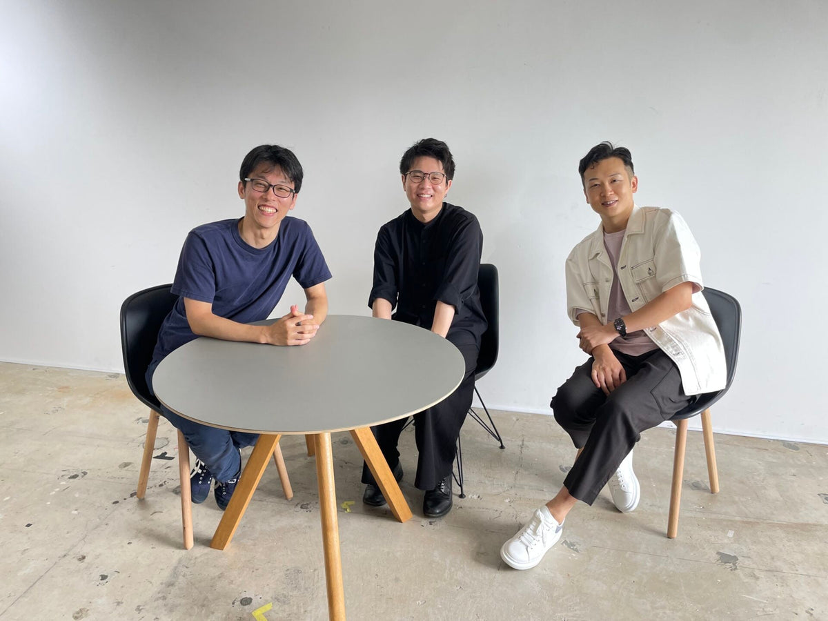
Looking back on the logo creation process, Kurose sat down with Fracta CEO Takanobu Kono and designer Kodai Ishiyama to discuss the thinking behind the new logo and the role it will play going forward.
(Kurose) First, please introduce yourselves to our Hero Magazine readers.
(Ishiyama) I'm Ishiyama, a designer at Fracta. I was in charge of the StoreHero logo renewal. Fracta is a company that helps launch new brands, develop existing ones further, and ultimately build the systems that allow brands to operate independently. As a designer, I'm primarily responsible for creating the visually visible side of brand creatives — the design itself.

(Kono) I'm Kono, CEO of Fracta. To add a bit more context: what we think of as branding is not simply designing a logo or crafting a worldview. A brand must fundamentally be operated and grown continuously, and that requires differentiation and brand strategy. Our job is to build the systems that sustain a brand, run those systems together with our clients, and ultimately enable the brand to run them on its own.
Within that, what Ishiyama handles is the creative side of the system. For StoreHero's logo renewal, his role was to ensure that anyone who sees it can immediately identify it as StoreHero's logo, and to create something that team members feel emotionally attached to — something that lifts their spirits when, say, they put it on a sticker.

(Kurose) When you say "system," you mean the overall framework, not limited to IT, right?
(Kono) Yes, the whole framework. In today's world, you can't move fast without technology, so we do use it — but we're not limited to IT. We think through, build, and run the entire system that sustains a brand, then walk alongside the brand until it can sustain that system on its own.
(Kurose) Our approaches differ, but perhaps what we're ultimately aiming for is the same as StoreHero.
A Logo That Conveys a Technology-Driven Growth Support Company
(Kurose) I first consulted with Kono-san about the logo renewal back in December 2022. At the time of this interview (August 28, 2023), we hadn't yet unveiled it to the public, but the shape of a product we had invested considerable resources in was becoming visible, and we were entering a time of change. We had primarily been offering consulting to Shopify merchants, and we wanted to create an image of a company that uses the product we developed to go even further in leveraging technology — that was the motivation behind the logo renewal.
We turned to Fracta because they know us well, listen closely, and seemed like someone we could work through things with together. Of course, the fact that Kono-san himself is deeply knowledgeable about Shopify was also a big factor. What was your reaction when you received the request?

(Kono) StoreHero is a company that I think reflects the character of its CEO, Kurose-san, very well. He's extremely earnest, and you just know he'll do excellent work if you ask him to. But that quality is hard to convey to someone who doesn't know StoreHero or Kurose-san personally. Especially for companies operating in the digital space, first impressions are everything.
My first impression of the corporate site before the logo renewal was that it seemed like a company doing something with Shopify — it didn't go much further than that. However, what Kurose-san is aiming for going forward is to provide both people and services under the banner of growth hacking, and I felt that the logo renewal was meant to signal that intention.
(Kurose) We placed the request at year-end and the logo was finished around March 2023, wasn't it? Is that a typical timeline for logo creation?
(Kono) It can take six months to a year at the longer end. In the past, once created, the same logo might be used for 50 years. In StoreHero's case, around three months is a typical timeline in today's terms. That said, completing the logo doesn't mean it's immediately revealed to the public. The process is called a rollout — for large corporations, it can require an education period to brief each department on the new logo, and time to properly apply it to signage and company vehicles. It's not unusual for a renewed logo to be seen by the general public six months after the logo itself is complete.
(Kurose) We incorporated a green meter visual into the logo. It represents a meter showing growth progress, and it's closely tied to the product we're developing.
The reason our rollout took time was that we wanted to launch the new logo timed with the completion of the product.

The Process of Creating a Logo Design with Flexible Adaptability
(Kurose) I'd like to unpack the specific process behind how the logo was created. Was it Kono-san who selected Ishiyama-san for this project?
(Ishiyama) Yes. Kono spoke to me and I took on the role. Since the brief was fairly loose — just a company overview and a rough idea of "what kind of logo we want" — I started by reviewing StoreHero's website and reading into what kind of business they run and what they're aiming for. I extracted frequently appearing words from the site and proposed around four design concepts based on those. Rather than presenting only the visible form of a design, I started by proposing the concept itself.
(Kurose) Honestly, we've heard that our current website can be hard to understand. What was your impression of it?
(Ishiyama) I got the sense that it leans toward a B2B style. It might also be because I was less familiar with Shopify than Kono at the time, which meant I needed to read more carefully into it. Characters appeared throughout the site and I got an impression of a lively, energetic, spirited company. The company name "StoreHero" made me wonder if it was a declaration that they themselves aspire to be heroes — but after speaking with Kurose-san, it became clear that the heroes are always the clients, and StoreHero itself plays a supporting role. Once I understood that concept, I was able to focus fully on crafting the visual form.
(Kono) I don't often get directly involved in creative projects myself, but the underlying philosophy — regardless of whether it's creative work or not — is to build things through communication. Rather than aiming for 100% completion before submitting to the client, we submit at 70–80% completion at high speed, then refine accuracy through back-and-forth exchange. So the initial concepts we submitted were really just opening moves to draw out the conversation about whether the hero was the client or StoreHero itself — which is entirely consistent with Fracta's standard approach.
(Kurose) That philosophy might be similar to how we approach growth, too. So it applies to branding and creative work as well.

(Kono) In conventional terms, it might actually be the opposite. Before the internet and digital came along, the dominant creatives were print media, signage, and TV commercials — and the only way to verify their effectiveness was after they had already been released to the world. You'd spend tens of millions or even hundreds of millions of yen, print or broadcast tens of thousands of copies at once, and only then could you evaluate them. That's why, when agencies presented to clients, they submitted work close to final-quality on the very first pass. Rather than refining through real consumer interaction, the work had to be at its best the first time it ever reached the public.
Digital, on the other hand, makes it essential to build in flexible adaptability. For that to happen, the DNA must be structured that way from the start — you have to deliver to the client in a state where adaptation is still possible. One reason I chose Ishiyama for StoreHero's logo renewal is that what he creates carries that gene of flexibility, and that approach feels very much of this era. If you start from a state where there's no room for adjustment and focus only on how to operate it as-is, the brand's growth potential diminishes. You have to think upfront, with the assumption that "there may be paths like this in the future." That's where Ishiyama and I are aligned. As digital becomes the primary arena, I think that approach will become the standard.
(Kurose) Is that way of working something specific to the digital space, or does it depend on the individual?
(Ishiyama) It varies by target audience as well, and I think advertising and branding differ significantly in terms of design approach. Advertising inherently requires grabbing people's attention with boldness or visual intrigue — design becomes the protagonist, in a sense. Branding, on the other hand, places the brand itself, its products, or its services at the center, and design plays more of a supporting role.
For StoreHero's logo, the most important thing wasn't for my design to steal the spotlight or for the logo itself to stand out — it was to communicate who StoreHero is. I think we managed to progress in a way where not just I but StoreHero itself was also actively thinking and feeling satisfied with the direction.
(Kono) I mentioned that our work is to build brand systems, run them, and ultimately create structures that allow the brand to operate independently — and that what Ishiyama handles is the creative component within that system. What we design is, like a car or a train, something that derives its value from being driven, from winning races. To use a car analogy, what's required isn't just the beauty of the object itself, but aerodynamics, cornering performance, and the expectation that it will run reliably for at least five or six years after purchase.
When it comes to website design, a single limited-period campaign landing page doesn't need to address longevity — but e-commerce sites, in particular, are precisely the kind of thing that must keep running. That thinking and process is very much alive in this logo renewal as well.
(Ishiyama) If at the first stage I had presented four fully realized logos at 120% completion — ones where I had thought through both concept and form completely — and asked them to choose, even if they did choose one, I think doubts might have emerged later: "Maybe the concept is slightly off," or "Maybe the feeling we wanted to convey isn't quite captured in the form." That's why I prioritized understanding what StoreHero truly wanted to express, and building the design from that foundation.
(Kurose) Indeed, while I did share an initial image at the start, seeing what came back sparked new realizations, and I found myself saying things like "Actually, I think it should be this way" — so I gave feedback several times.
(Ishiyama) That's not unique to StoreHero — it's quite common for clients to see what's been created, have new realizations, and provide feedback. I remember feeling that it was constructive and positive throughout the process.
(Kurose) You advised us to gather opinions from our employees, didn't you? When we actually did, opinions were quite divided. There was a design I was personally set on, but the team's opinions differed. I had assumed that since these were team members who were fully committed to StoreHero, they'd share similar views on the logo — so I was surprised. When I read through the reasons people gave for their choices, each one made sense in its own way. It was good to see so many different perspectives, and I was grateful to gain viewpoints about my own company that I hadn't held myself. I came to see this too as a necessary part of the logo renewal process.
An Experience That Is Rare for Both the Brand and the Creator
(Kurose) We went through several rounds of exchanges, but were there any difficult areas or challenging leaps you had to make?
(Ishiyama) First, there was the fact that we devoted the first two of our four proposal rounds purely to concept-making.
Through that process, a direction emerged: we wanted to go with a concept expressing clients growing steadily upward and becoming heroes. Once the concept was set, the usual struggle of building out the visual form began. From the third proposal onward, rather than showing only the pieces I had put the most effort into, I presented 20 to 30 in-progress form studies and asked them to select together with me. It wasn't only me challenging myself — Kurose-san was wrestling with it alongside me. Through that process, a great deal became visible.

(Kurose) One source of conflict was the hero character that had been featured alongside our previous logo. We ultimately decided to keep the character in various places, but simplify the logo itself and improve its recognizability. Since some people had come to associate us with that character, there was a sense of conflict. Ishiyama-san offered proposals for how and where to use the character going forward, which allowed me to ultimately make the decision.
(Ishiyama) What a brand has cherished is an asset, so there's naturally a sense of loss in letting it go. However, characters are difficult to handle in small-scale applications like logos. Many brands remove their character from the logo itself while preserving it in other ways — such as featuring it in various parts of their website. We proposed making the logo strong and clear on its own, while suggesting ways to keep the character alive elsewhere on the site.
(Kurose) Part of the reason for my conflict was that the character was designed by my younger sister. When the company was founded, she created it to express our desire to "make merchants into heroes" and "make everyone involved with us into heroes." And I thought that if we became well-known, the character she created might become well-known too. Those feelings added to my sense of conflict.
At the same time, I also wanted to make Ishiyama-san and the others involved in the logo renewal into heroes. I thought that if the character remained in a half-hearted way and didn't work well with what Ishiyama-san had crafted, that wouldn't be right either. The proposal we received allowed both elements to coexist in a non-compromised way — it just fell into place, and I felt an immediate sense of clarity.
(Ishiyama) I'm really glad the proposal helped resolve it and brought you peace of mind.
(Kurose) This was something I was unaware of before, but colors can appear differently on digital devices versus on printed paper. Ishiyama-san personally brought printed output to our office, and it made me realize how important that is.
(Ishiyama) For StoreHero, given the nature of your business, thinking digitally first is the right approach — but logos will also appear on printed materials like business cards. Because the range of colors that can be expressed differs between digital devices and print, we were conscious of minimizing the difference in how those colors appear. It's also something we cared deeply about precisely because a corporate logo is meant to be used for 10 or 20 years.
(Kurose) At this point, the renewed logo is featured on our website and on the admin panel of StoreHero, the growth platform we're developing. Going forward, we want to display it in more places and have it recognized by many more people. As the creator of the logo, do you have any hopes for how you'd like to see it used?
(Ishiyama) I'd be happy if it helps convey what StoreHero is striving for — to both internal and external audiences — and contributes to greater recognition. As for the meter design that expresses the progression of growth, I think it's a clever device within a logo. When it comes to the products where the logo will appear, there are aspects of how StoreHero and its clients will actually use it that I don't fully know yet, so I hope the logo can fulfill its role there as well.
(Kurose) We've already communicated to our in-house engineers that the meter form in the logo represents the progression of growth. Going forward, I'm thinking it would be great to use the logo's meter design within the product itself to visualize growth progress.
(Kono) I said that what we design is, like a car or a train, something that derives its value from being driven and winning races. The more it's used, the more it builds Ishiyama's confidence, and being used reveals things that wouldn't otherwise surface — like "if it's going to be used this way, I should have designed it differently." In reality, opportunities for a creator to see their own work in action and gain new insights from that are not as common as one might think. For Ishiyama, being able to see how something he created like his own child goes out into the world and proves its worth is enormously significant.
And of course, being involved with a growing service or business is itself a major experience for a creator. We're committed to improving the success rate for every brand we work with, but the outcome also depends heavily on the strength and condition of the brand or product at that point in time. If Ishiyama had been a 20-year veteran who had only ever handled massive-scale projects, it wouldn't have been the right fit. The kind of encounter where "choosing Ishiyama at this stage in his career and having it succeed would be something extraordinary" is genuinely rare.
There are experiences that are only possible at a specific moment in time, for both the brand and the creator — and I see creating those encounters as my job.
(Kurose) Thank you. At the time we made the request, Ishiyama-san was only one or two months into joining Fracta, right at the stage of "let's give it our all." Similarly, we were at the moment of "let's push forward with the product launch." I hadn't consciously thought about it at the time, but hearing you explain it now, the reasoning behind choosing Ishiyama-san really clicked for me.
(Ishiyama) That logo ultimately emerged from StoreHero — from Kurose-san and the rest of the team — and I believe it captures StoreHero as it stands today. As Kono said, I hope you'll use it to the fullest.
