Once you launch the Shopify store, you are worried about increasing your CVR(Conversion Rate), aren’t you?
The product itself has the most significant effect on the Shopify store’s sales and CVR. The product page has the second-largest impact on CVR.
To improve the cost-effectiveness of advertising and CRM (Customer Relationship Management), increasing CVR is the first thing you must do once you launch the store.
This time, I will introduce how to boost the product page CVR.
Contents
Keys for Improving the Product Page
Here are three critical points of the product page.
- Mainly focusing on UVP (Unique Value Proposition)
- 10-15 seconds of a purchase decision
- Mobile-first
There are many tips to improve the product page. But it is significantly effective by focusing on these three points in the beginning.
Focusing on UVP
UVP is an abbreviation for the Unique Value Proposition. Simply, it means “Selling point.” Design the product page to convey and stand out what the selling point is.
The following three elements are essential to convey the product’s selling points.
- Obtain profound knowledge of your product selling point.
- Explain the selling point concretely.
- The more distinctive the selling point is, the better it sells.
It is impossible to convey the selling point without understanding the product. Why don’t you ask your customer if you don’t have enough knowledge of your item? “Why did you buy it?”
The more specific the selling point is, the more it is transmitted. It is better to explain that “it is as light as 10 cm X 10 cm squares of tissue paper” rather than just “light.”
The more distinctive the selling point, the better it sells. However, if you compete on the functional axis, it would be a red ocean. It is critical to focus and identify your targeted market, such as “the most popular bag in the IT industry.”
10-15 seconds of Purchase Decision
The confusing product descriptions drop CVR. Preferably, you should design a product page that you can intuitively understand.
Designing the product page to make a purchase decision within 10 to 15 seconds is ideal.
The following four decisions will be made when a customer purchases a product. Design the product page, which can complete until the third step (Desire to buy) within 10-15 seconds.
- Have an interest in a product
- Get to know a product
- Desire to buy
- Make a purchase decision
Product images and visual aid are useful to gain interest and get to know the product. You intend to comprehend the item just looking at the visual aid, rather than reading full detailed descriptions.
It is practical to prepare the product image that the customer can rely on when making a purchase. It encourages a quick purchase decision.
Mobile-first
In general, mobile users have more traffic and purchases in personal use products. Therefore, when there is a trade-off between mobile and desktop usability, mobile should be the priority.
Even if desktop users have more traffic and purchases, mobile is more affected by usability. When it comes to usability, you should still be highly aware of the mobile.
11 To-Do Lists
Based on the three main elements of the improving product page, here are 11 specific To-Do lists.
Main Product Image
As I have explained earlier, there is nothing more effective than the product image. Use images of products that are bright and allow customers to determine what the product is.
This product image can be often used for shopping ads on Google and Facebook. Viewers won’t click on the product image if it is unclear and hard to understand at a glance. It is necessary for advertising operations.
The high-resolution image is functional to enable enlargement. However, do not make the image too heavy since it slows down the page.
There is an image compression app like TinyIMG. It is useful when the page is too slow due to massive photos.
There’s also a Shopify App that will implement your pages to AMP (Accelerated Mobile Page.) AMP by Ampify Me is an app to increase mobile sites’ display speed by caching it in the CDN (Content Delivery Network).
The AMP-compatible web page displays much faster when it inflows from search engines or SNS on mobile.
It is often said that converted to AMP has an SEO (Search Engine Optimization) effect. It isn’t true; even converted to AMP, the search ranking will hardly rise. The AMP supports to increase the display speed and result in a higher CVR.
* Please note that functions such as recommendations and wishlists may not work with AMP implementation in some cases.
Image Gallery
The image galleries are as common as the main product image. The image gallery is a function to replace the main product image.
In the image gallery, prepare photos of several different variants that your customers may want to see before purchasing.
The following is the Shopify store, Red Bull’s online store. It uses the image gallery to introduce different color variants.
The image you want to show often differs from what your customers want to see. I will introduce tools that are inevitable to analyze and improve such gaps.
Primary Product Information
The primary product information is as follows. I often focus on product titles, briefings, and prices.
- Title
- Briefings
- Price
- Functional Feature
- Variants
Product Title
Except for the case of branding, the product title should be easy to remember (easy to search again). Name the product with the label which hasn’t been used in other companies’ products.
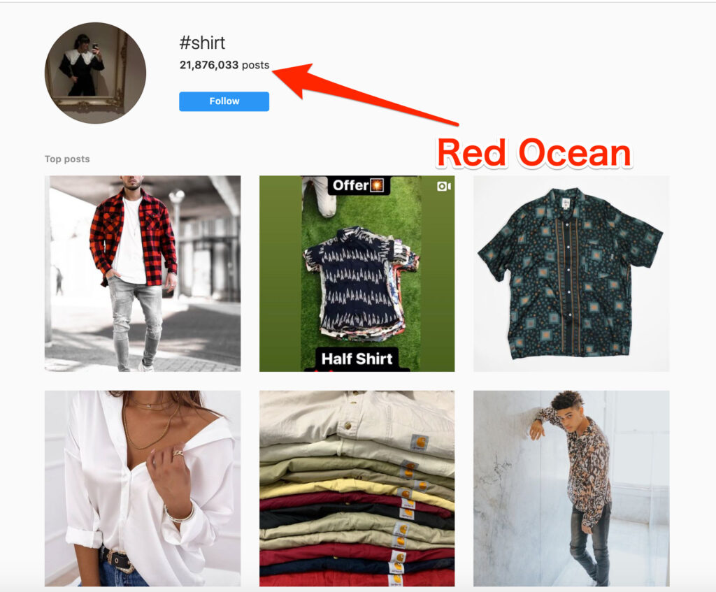
For example, change the product name to “pants.” Nobody will reach your product page by searching on Instagram or Google since the name is too ordinary. It will be overwhelmed with the contents of other companies and individuals.
Product Briefings
The product briefings should be concise and convey the UVP, as I explained at the beginning. On the Glossier product page, each product has its strengths that are easy to define. It introduces the item’s features in a concise and easy-to-understand manner—Hurray to a unicorn company.
Product Price
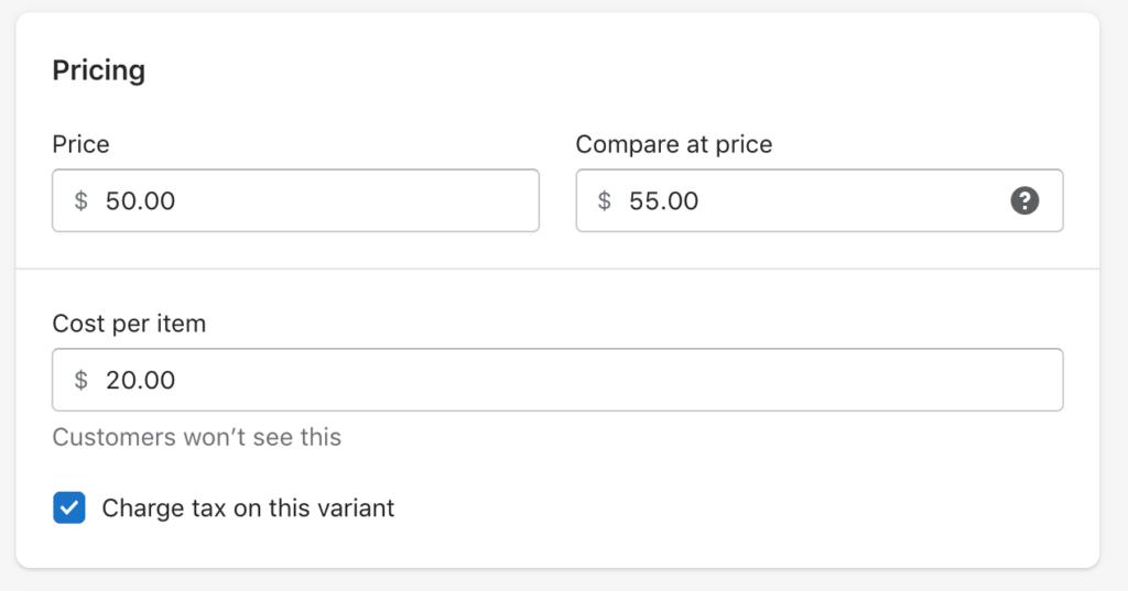
If you give a discount, list both the regular price and the price with a deal to indicate the value. Line up the cost of the products if there is a high-end version of the product. It emphasizes the products’ worthiness.
An American media personality Kylie Jenner operates a cosmetics brand KYLIE COSMETICS, on Shopify. It shows the discount amount on the product page.
Displaying pre-discount prices is Shopify’s default feature. Register the “Compare at price” on the Shopify setting; it automatically shows on the most Themes.
Reviews and Ratings
Reviews and third-party ratings can help boost customers’ purchases.
With the Shopify review apps, Yotpo and Stamped.io, are easy to implement. These are highly functional apps with the ability to distribute emails and coupons to collect reviews.
Reviews and evaluations from third parties are one of the measures called social proof. Please refer to my previous article on how to use social proof in Shopify.
A new store with an unestablished brand should use social proof on its product page.
It is practical to hand-sell products or provide product samples to collect reviews before launching the store to create social proof.
Detailed Product Description
Win or lose is already decided before reading the detailed product description (LOL). It is quite challenging to flare up at this point.
Then, what the purpose of the detailed product description is. It is for a customer to confirm that their judgment is correct.
Place contents that will resolve the concerns ahead of time. What are you worried about when buying products on e-commerce?
Depending on the product, there are various concerns, such as the following. It is good to eliminate such anxiety in advance.
- It wasn’t what I expected.
- It didn’t suit me.
- Couldn’t use it properly.
- There was something else better.
- It was cheaper to buy it elsewhere.
- Torn/broken immediately.
- The sizing wasn’t right.
- The box was dirty. Even it was for a gift.
- It didn’t arrive on the required date.
- The defective product has arrived.
Includes the following three explanations into the detailed product description to eliminate such misunderstanding.
- Usage scene
- Method of usage
- comparison chart
- size
Embed video clips help customers to have ideas of usage scenes and methods of usage.
Inserting video is most supportive when a product with many functions. Explaining each feature with images and text would be too much. On the other hand, with video, it can be explained sufficiently.
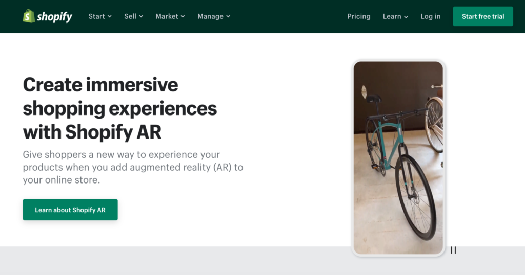
In addition to videos, Shopify can also promote products in AR (Augmented Reality). I haven’t tried it yet. It could increase CVR ridiculously. Please share your comment on this blog if you have already tried it.
Enhance Customer Trust
To eliminate anxiety, it requires indicating the following information in addition to enriching the product page. It’s dull but necessary for worried shoppers.
- Money-back Guarantee
- Return Policy
- Shipping Information
It’s thoughtful to set up a real-time chat customer support service. In addition to ordinary chat, there are various Shopify Apps with a chatbot function connected to Facebook.
Reference: Shopify Chat App examples
Although it is not a Shopify App, a SaaS ManyChat which can integrate with Shopify is convenient.
Recently, I used it for the first time. It notifies the amendment checkout email, acquires customer attribute information (gender, email address, etc.) in chat and saves it as customer data in cooperation with Shopify.
It’s better to ask for personal information naturally in conversation than to request in the input form.
Purchase Promotion
Let’s take the last push tactic.
Display the remaining inventory and number of customers real-time views rush your customer to make a decision. It says, “If you leave it unpurchased, other people will buy the product, and you will lose the opportunity to buy it.”
You can use the Shopify App called Fera to display real-time inventory and customer views.
Do the above, and your customers will buy the product for sure. There are some other strategies for non purchased products. I will introduce those below.
Wishlist (Favorite)
Introducing the wishlist function assists customers to register undecided products as favorites. It will operate campaigns to bring back customers to purchase the product at the next consideration timing.
The Shopify App, Wishlist Plus, makes it easy to customize your favorite features.
Inventory Reminder
No matter how much customers want, they can’t buy it if it’s out of stock. In such cases, inventory reminders are obliging.
Register on restock alert; customers will receive a notification when it is in stock again and will be able to purchase it.
The Shopify App Back in Stock, an inventory reminder app, deploys inventory reminders.
Recommendation
If a customer doesn’t like the item, there still is the possibility she/he may buy another thing.
Product recommendations affect on encouraging retaining purchase behavior and recommend related products.
Shopify has a lot of apps that recommend related products.
Use automatic recommendations based on data if the number of purchases for each product is large enough. If the number of assets for each product is insufficient, set a collection based or manual recommendations.
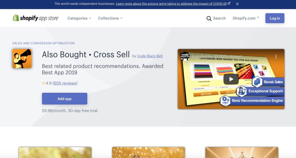
The Shopify App Also Bought supports both manual and automatic recommendations. You can make slight adjustments, such as excluded products.
Analysis & Improvement
I have explained the tips to increase the CVR of the product page. Even if you think you’ve done it all, unfortunately, it often doesn’t improve as you expected.
In such a case, analyze and improve it. The following are the most commonly used tools for analysis.
- Hotjar / Lucky Orange
- Google Search Console
- Google Optimize
Hotjar / Lucky Orange
Hotjar and Lucky Orange will record how your customers are looking at your product page.
While watching the recorded video of customer behavior, check the lists below, and make improvements.
- Does a customer see what you intend?
- Is it difficult for a customer to understand?
- Is a customer looking into rather than you expected?
Google Search Console
Google Search Console can be used to improve the product page.Select the target page in the Search Console,
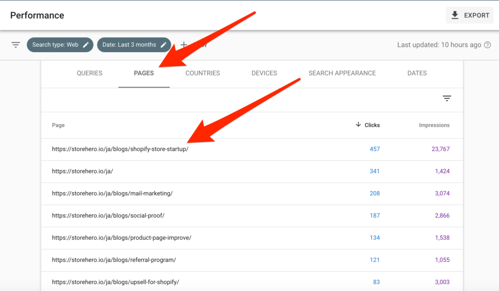
and extract the keywords that flow into the target page.
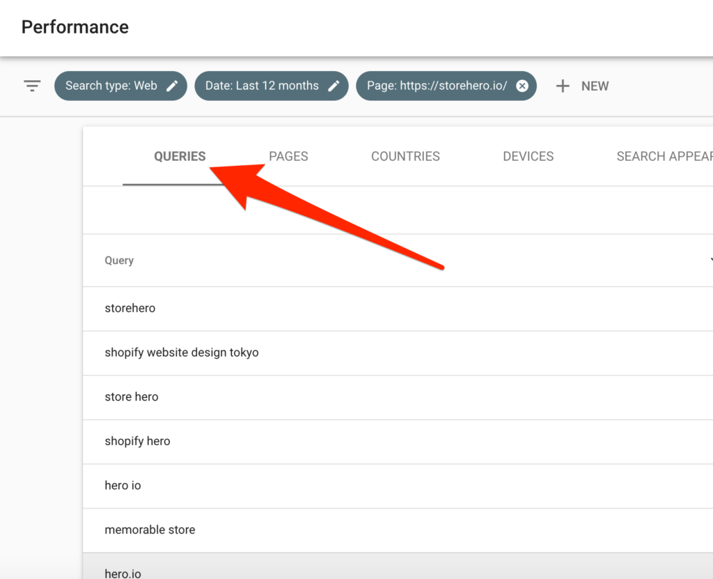
Inflow keywords are equivalent to customer demands. Modify them if the information and expressions don’t meet customer demands.
Google Optimize
You may wonder which image and expression are better on the product page.
Perform A/B testing with Google Optimize to see rigorous results.
The previous article briefly introduced how to use Google Optimize. It’s much easier than you think.
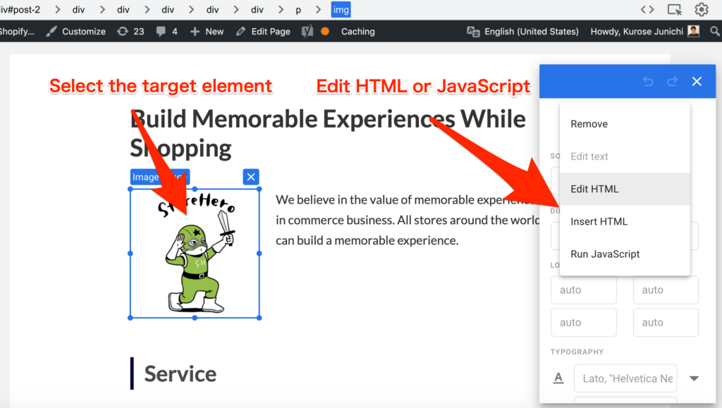
By the way, I used to develop an A/B testing tool and performed it a lot. From my experience, testing on incidental details wouldn’t differ in the results. Start with items that have an enormous impact on the product page CVR.
In the case of the product pages, consider performing an A/B test from that factor with high impact. It is sorted by high to low effect CVR in this article.
Learning from Case Studies
It applies to every aspect. Examining and summarizing a handful of case studies will ensure successful tips. It increases CVR promptly.
Let’s analyze a large number of case studies using a site that collects them.
Summary
I’ve introduced how to enrich the product pages that strongly affect CVR.
I highly recommend creating an enrich product page before actively implementing aggressive strategies, such as advertising and CRM (Customer Relationship Management).
After growing CVR, the effectiveness of offensive strategies such as advertising and CRM will increase, and you will gain more resource advantage.
Please share your strategy on the product page that has resulted in a furiously high CVR. Your comment is highly appreciated.
GrowthHack consulting services specialize in Shopify
StoreHero provides the Commerce Hack and a growth hack consulting service specialized in Shopify.
It supports Shopify owners to grow faster, get their businesses back on track, and run their businesses.
If you want to use Shopify to grow your commerce business, please do not hesitate to contact us.


